4 New Web Design Trends For A Powerful Site In 2019
Like it or not, 2019 is here. We are on to a new year and with a new year comes new trends in marketing and design.
Although the last year brought us some great trends, 2019 will bring some even more sophisticated new web design trends.
The world of web design is constantly in flux, and as a business with an online presence, it’s up to you to stay up on the newest and best designs. If you want to keep your customer’s attention, there are some great new designs that will help you do just that.
What Makes Good Web Design
Well designed websites will leave the user feeling satisfied with their experience on the site. There is a certain type of gratification that a great site will leave you with.
A simple design with a great color scheme and carefully crafted logos will take you a long way. However as we dive deeper and deeper into the connection between psychology and marketing, things tend to get a bit more complicated.
Web design is not only an art, but also a science, and as such requires a significant amount of research in order to use your tools to their greatest potential. With that idea in mind, here are our 4 new web design trends for a powerful site in 2019:

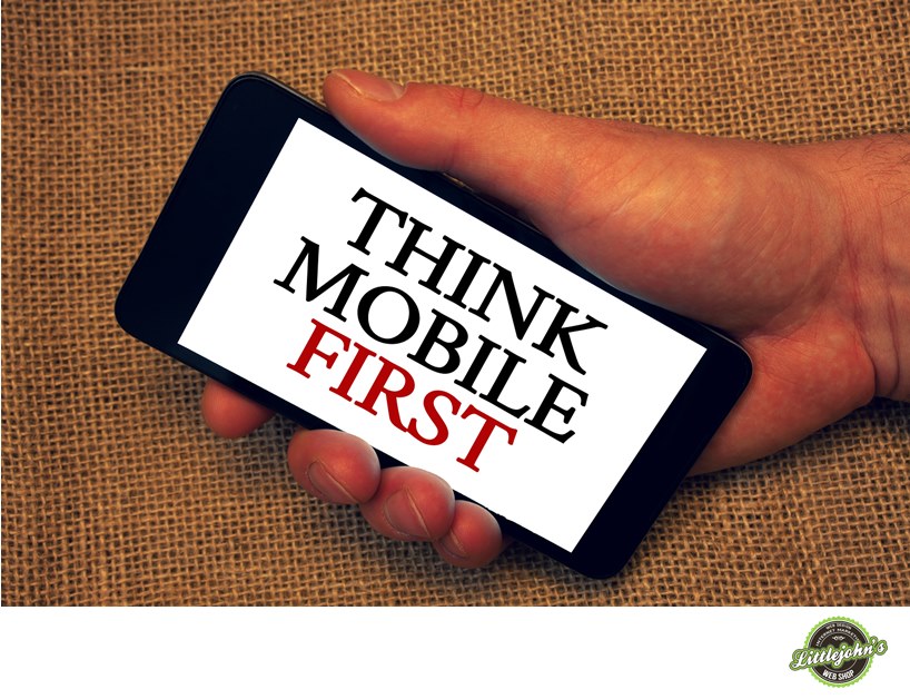
Mobile First
Mobile devices aren’t going anywhere. They are the most convenient way for users to browse the web and they take their phones with them everywhere they go. In fact, according to this study, the percentage of website traffic worldwide that was viewed via mobile devices has increased from 31% in 2015 to 52% at the end of 2018.
Since your customers are likely going to view your content via a mobile device, it would only make sense to cater to that. This means that your site is designed with mobile viewing being the first consideration.
Websites look much different when viewed on a vertical 3”x 5” screen as opposed to a desktop screen. This is why designing “mobile first” is so important.
You also have to consider the fact that they are interacting with your content with their thumbs, and not with a mouse. This is why many designers are starting to make their sites with thumb-friendly navigation.
Planned Asymmetry
For a very long time, symmetry has been the gold standard for marketing. Whether it was a website, a print ad, or any type of advert, if it didn’t have some sort of symmetry it looked sloppy and unappealing to the eye.
However more recently, web designers have been toying with the idea of asymmetry on their sites and have had some great outcomes. It turns out that using asymmetrical design can really help your website stand out.
This idea is fairly simple in essence, yet quite difficult to execute successfully. You need to be able to add asymmetry to your design without it looking sloppy, and there are some very good ways to achieve this effect.
Minimalism
You know the old saying, Keep It Simple Stupid. Many designers live by this code, and there are some very good reasons why. Minimalist sites tend to get people
Heavy sites can get annoying to wait for, and loading a simple, minimalist site will offer your users a great experience. It really depends on what type of business you’re running, and where you expect to see the most sales.
For instance, a site with an e-commerce store is going to want people to stay on as much as possible. Alternatively, a site with a physical storefront is going to want to get people off their site and into their store as soon as they can. This is when a minimalist site will come into play.
Video Content/Backgrounds
Video is what keeps people’s interest. So much of the content on the internet is video content, and that is where we will continue to gravitate toward. Although one school of thought says that minimalism is the way to go, some claim that complexity is what helps their site thrive.
Giving your users an opportunity to check out some content on your site through video is going to encourage them to interact with your site more, especially if you’re keeping that content fresh.

While some heavy video backgrounds may slow down your user’s experience, it will keep them on the page longer and give them more content to consume. Videos in general are more interesting than images and text, and will keep your customers interest better than either.
The right design for
For more information on web design, or to get a free website estimate, click here.


